Sophie Maxwell, head of insight at Pearlfisher, discusses the cultural changes in luxury consumption, leading to the re-emergence of white as the ultimate luxury palette
CONSUMERS
The Colour of Luxury

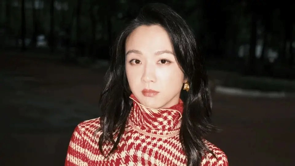
GIvenchy Haute Couture, Fall 2012
Luxury is as much about what is instinctively understood as what is explicitly said. Historically, this means its codes – iconography, signature materials, colours and evidence of originality and craftsmanship. These codes have been the most powerfully recognised and integral communication. Tiffany blue, Chanel’s interlocking C’s, Goyard’s three chevrons – an individual and valuable language created by each brand to implicitly communicate its persona and values as well as to safeguard its exclusivity.
Traditionally luxury was about empires and etiquette. It was about seduction and the allure of the unattainable and these elements became the signifiers of a brand’s heritage, the way we were introduced to and embraced the richness of their craft.
But now, in modern times, the luxury market has been plundered for its previously unique communication as new premium extensions of mass brands have enticed different markets to change their aspirations and ‘trade up’. Suddenly even the most everyday products have a ‘luxury’ counterpart that claims to be superior but that is often only symbolized by the borrowed aesthetics of luxury brands. Black, silver, gold, serifed typography, initialed icons, words like ‘finest’ have all been adapted and adopted to the point where they are no longer shorthand for the elite but instead cover the nebulous divide between luxury and premium goods from indiscriminate sectors.
“ What is genius but the power of expressing a new individuality – Elizabeth Barrett Browning ”
To protect itself the luxury world created new sensibilities suggesting a new kind of luxury focused on the intangible and moving us away from overt material things to more discreet and special experiences. Design houses like Bottega Veneta have placed their emphasis on design elements that defy counterfeiting, not using visible logos but instead using their signature intrecciato leather weave created by artisanal production as their hallmark. Whereas Celine use colours and materials in a deliberately restrained way that completely resists the overt use of branding, and also focuses on reframing the product – rather than the brand – as the object of desire.
These unique and elite experiences are a move to once again raise – or perhaps safeguard – the luxury bar and we have seen some interesting and perhaps extreme new approaches to creating new visual languages for luxury. But as we now look at new ways of expressing creative and cultural change we are starting to see yet another shift with colour codes as we witness the emergence – or re-emergence – of the use of white as the ultimate luxury palette. Its delicate nature – often associated with royalty and spirituality – signals a return to a luxury ideal that is cherished, and sees the creation of items and environments that require care, attention to detail and reverence.
“ The first of all colours is white. We shall set down white for the representative of light, without which no colour can be seen – Leonardo da Vinci ”
White is austere. Martin Margiela’s scent (untitled) uses the purity of white to frame the austerity of his design ideals.

White is startling. Givenchy’s 2011 Spring Summer campaign features an all white image by photographers Mert Alas and Marcus Piggott, designer Riccardo Tisci’s muse Daphne Groeneveld and albino model Stephen Thompson.

White is about limited footfall. The Barker Black brand, which has epitomised ‘modern English refinement’ since 1880 has created white suede brogues to display the intricacy of their craftsmanship.

White is intricate. The elaborate detail of ‘ornament’ by Sam Baron for Alegre tableware.

White is a showcase. Mariage Frères Copenhagen studio by WE Architecture – white creates a startling frame for this richly traditional tea brand to create the ultimate elite experience.

White is wonder. The most beautiful of all examples. St. Hilaire church in Melle by Mathieu Llehanneur uses white marble and fluid forms to symbolize the purity, innocence and experience of white.

Creating new visual expressions that allow brands to evolve whilst communicating their original characteristics and protecting their integrity is the role of branding and now – in the wake of the fracturing of the luxury world – this is of growing importance and significance for the future of luxury branding. Today, as we see power shifting away from the West and new powerhouses rising elsewhere – all giving life to many different takes on luxury, all based on different cultural values and all influencing each other – creating brand expressions that transcend these differences but that also truly communicate difference, specialness and a true luxury experience is our most important challenge.
“ Fashions fade, style is eternal – Yves Saint Laurent ”
Luxury today is defined – and directed – by its very many contradictions: it is both Western and Eastern, extreme and subtle, public and private, worshipped and discovered. Our current fascination with white – and its qualities and applications – is just an example of one way in which we are rising to the new challenge. But the greater point is that creating a truly differentiating expression is not just the job of a badge that can be imitated but involves bringing the brand’s values to life across all touch-points – both traditional and new. We must reconsider our values and how we communicate them through the unique elements of our identities – to create expressions that take us beyond the superficial and express a truly inspiring and dramatic difference.

Insight Director, Pearlfisher
For the past twelve years, Sophie has been using her eye for detail to scrutinize the visual identities of multi-national companies in every category, from finance and telecoms to personal care, beverages and luxury brands. Now, as Head of Creative Insight at Pearlfisher, she is present throughout the creative process, evaluating clientsʼ brands by identifying the value of their past and the opportunities of their future, helping us to rebuild them into stronger, more meaningful, future-proofed versions of themselves.
CONSUMERS
The Colour of Luxury
Sophie Maxwell, head of insight at Pearlfisher, discusses the cultural changes in luxury consumption, leading to the re-emergence of white as the ultimate luxury palette
GIvenchy Haute Couture, Fall 2012
Luxury is as much about what is instinctively understood as what is explicitly said. Historically, this means its codes – iconography, signature materials, colours and evidence of originality and craftsmanship. These codes have been the most powerfully recognised and integral communication. Tiffany blue, Chanel’s interlocking C’s, Goyard’s three chevrons – an individual and valuable language created by each brand to implicitly communicate its persona and values as well as to safeguard its exclusivity.
Traditionally luxury was about empires and etiquette. It was about seduction and the allure of the unattainable and these elements became the signifiers of a brand’s heritage, the way we were introduced to and embraced the richness of their craft.
But now, in modern times, the luxury market has been plundered for its previously unique communication as new premium extensions of mass brands have enticed different markets to change their aspirations and ‘trade up’. Suddenly even the most everyday products have a ‘luxury’ counterpart that claims to be superior but that is often only symbolized by the borrowed aesthetics of luxury brands. Black, silver, gold, serifed typography, initialed icons, words like ‘finest’ have all been adapted and adopted to the point where they are no longer shorthand for the elite but instead cover the nebulous divide between luxury and premium goods from indiscriminate sectors.
“ What is genius but the power of expressing a new individuality – Elizabeth Barrett Browning ”
To protect itself the luxury world created new sensibilities suggesting a new kind of luxury focused on the intangible and moving us away from overt material things to more discreet and special experiences. Design houses like Bottega Veneta have placed their emphasis on design elements that defy counterfeiting, not using visible logos but instead using their signature intrecciato leather weave created by artisanal production as their hallmark. Whereas Celine use colours and materials in a deliberately restrained way that completely resists the overt use of branding, and also focuses on reframing the product – rather than the brand – as the object of desire.
These unique and elite experiences are a move to once again raise – or perhaps safeguard – the luxury bar and we have seen some interesting and perhaps extreme new approaches to creating new visual languages for luxury. But as we now look at new ways of expressing creative and cultural change we are starting to see yet another shift with colour codes as we witness the emergence – or re-emergence – of the use of white as the ultimate luxury palette. Its delicate nature – often associated with royalty and spirituality – signals a return to a luxury ideal that is cherished, and sees the creation of items and environments that require care, attention to detail and reverence.
“ The first of all colours is white. We shall set down white for the representative of light, without which no colour can be seen – Leonardo da Vinci ”
White is austere. Martin Margiela’s scent (untitled) uses the purity of white to frame the austerity of his design ideals.
White is startling. Givenchy’s 2011 Spring Summer campaign features an all white image by photographers Mert Alas and Marcus Piggott, designer Riccardo Tisci’s muse Daphne Groeneveld and albino model Stephen Thompson.
White is about limited footfall. The Barker Black brand, which has epitomised ‘modern English refinement’ since 1880 has created white suede brogues to display the intricacy of their craftsmanship.
White is intricate. The elaborate detail of ‘ornament’ by Sam Baron for Alegre tableware.
White is a showcase. Mariage Frères Copenhagen studio by WE Architecture – white creates a startling frame for this richly traditional tea brand to create the ultimate elite experience.
White is wonder. The most beautiful of all examples. St. Hilaire church in Melle by Mathieu Llehanneur uses white marble and fluid forms to symbolize the purity, innocence and experience of white.
Creating new visual expressions that allow brands to evolve whilst communicating their original characteristics and protecting their integrity is the role of branding and now – in the wake of the fracturing of the luxury world – this is of growing importance and significance for the future of luxury branding. Today, as we see power shifting away from the West and new powerhouses rising elsewhere – all giving life to many different takes on luxury, all based on different cultural values and all influencing each other – creating brand expressions that transcend these differences but that also truly communicate difference, specialness and a true luxury experience is our most important challenge.
“ Fashions fade, style is eternal – Yves Saint Laurent ”
Luxury today is defined – and directed – by its very many contradictions: it is both Western and Eastern, extreme and subtle, public and private, worshipped and discovered. Our current fascination with white – and its qualities and applications – is just an example of one way in which we are rising to the new challenge. But the greater point is that creating a truly differentiating expression is not just the job of a badge that can be imitated but involves bringing the brand’s values to life across all touch-points – both traditional and new. We must reconsider our values and how we communicate them through the unique elements of our identities – to create expressions that take us beyond the superficial and express a truly inspiring and dramatic difference.
Insight Director, Pearlfisher
For the past twelve years, Sophie has been using her eye for detail to scrutinize the visual identities of multi-national companies in every category, from finance and telecoms to personal care, beverages and luxury brands. Now, as Head of Creative Insight at Pearlfisher, she is present throughout the creative process, evaluating clientsʼ brands by identifying the value of their past and the opportunities of their future, helping us to rebuild them into stronger, more meaningful, future-proofed versions of themselves.